.svg)
The hero section is the first thing visitors see, and first impressions matter. Top brands invest time and creativity in designing bold hero sections.

The main section is the first thing visitors see, and first impressions matter.
That’s why top brands invest time and creativity in designing bold, engaging, and high-converting main sections.
As a Webflow agency, we love to analyze the main sections of famous websites and rebuild them within Webflow, showing clients how flexible and powerful this platform really is.
In this post, I’ll share how we recreate main sections from top sites in Webflow and what you can learn for your own projects.
1.Stripe
Webflow tip: Use section padding and max-width to mimic Stripe’s minimalist style.
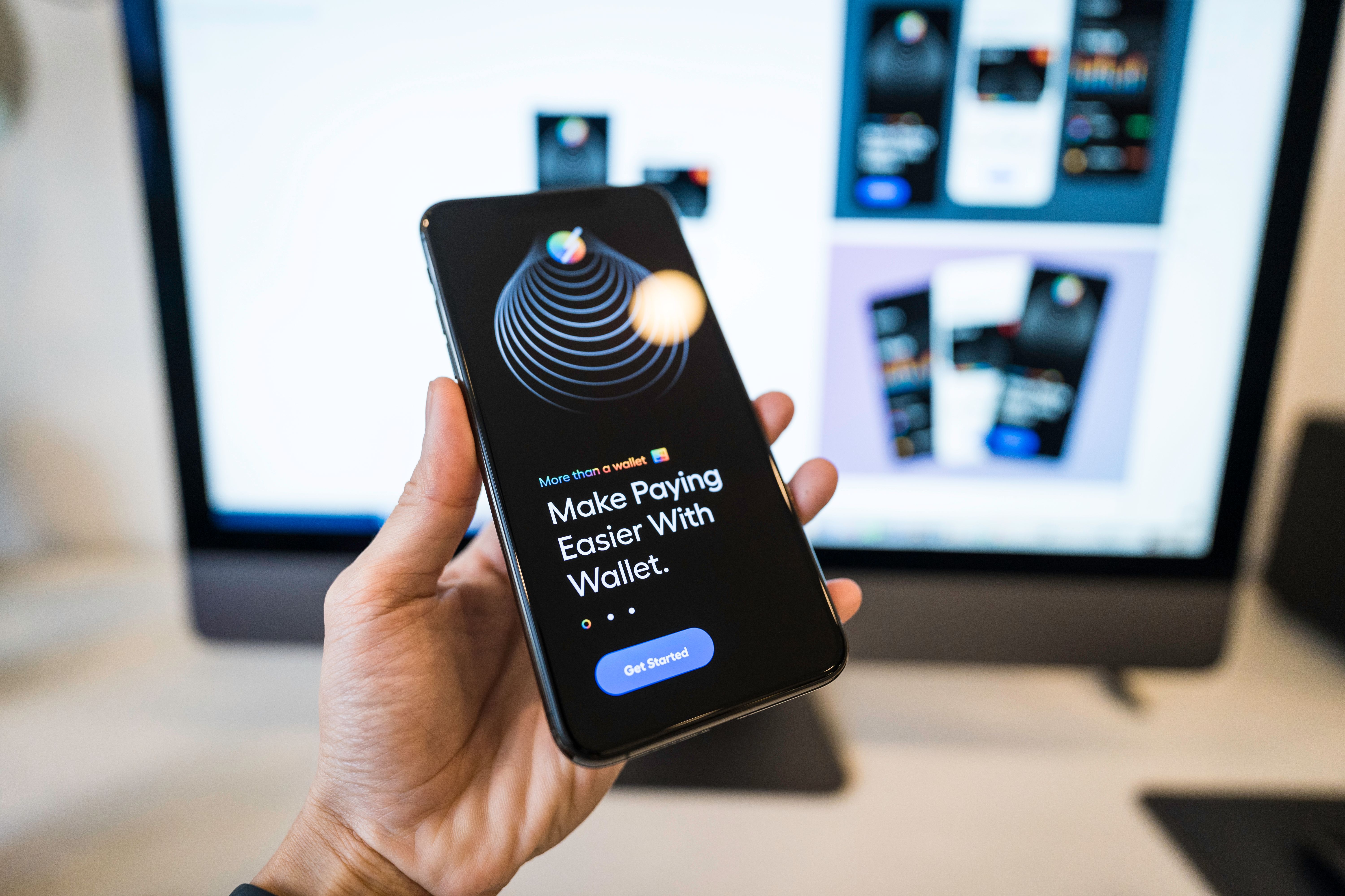
2.Apple
Webflow tip: Use absolute positioning and interactions to smoothly reveal images.
3.Airbnb
Webflow tip: Redesigning similar search layouts using div blocks and button interactions for a similar feel.
Look at the layout, typography, call to action placement, and visual hierarchy.
Use Flexbox or Grid, set appropriate padding, and structure your content logically.
Match font weights, sizes, and color schemes to get the feel of the original design.
Use Webflow’s native interaction panel to recreate:
If you want to design websites that grab attention from the first second, mastering headers is essential.
By studying and recreating the best headers in Webflow, you’ll hone your skills and achieve better results for your clients.


.jpg)
.jpg)