Top 10 Examples of High-Converting Webflow Landing Pages

A landing page can make or break your conversion rate. Whether you’re selling a product, collecting leads, or promoting a service, Webflow gives you everything you need to build pages that convert. But design alone is not enough you need strong UX, clear messaging, smart structure, and optimized interactions.

Read time:
2 minutes
Author:
Bojana Djakovic
Published:
November 19, 2025

Memberstack – Clean, Trust-Building Hero

Why it converts well:

  • Short, value-driven headline
  • Strong CTA above the fold
  • Social proof + brand logos
  • Frictionless sign-up

Takeaway: Keep your hero simple and make your primary CTA impossible to miss.

Finsweet – Bold Positioning & Clear Value

Why it works:

  • High-contrast design
  • Clear statement of expertise
  • Strong use of case studies

Takeaway: Bold messaging and proof of experience instantly build authority.
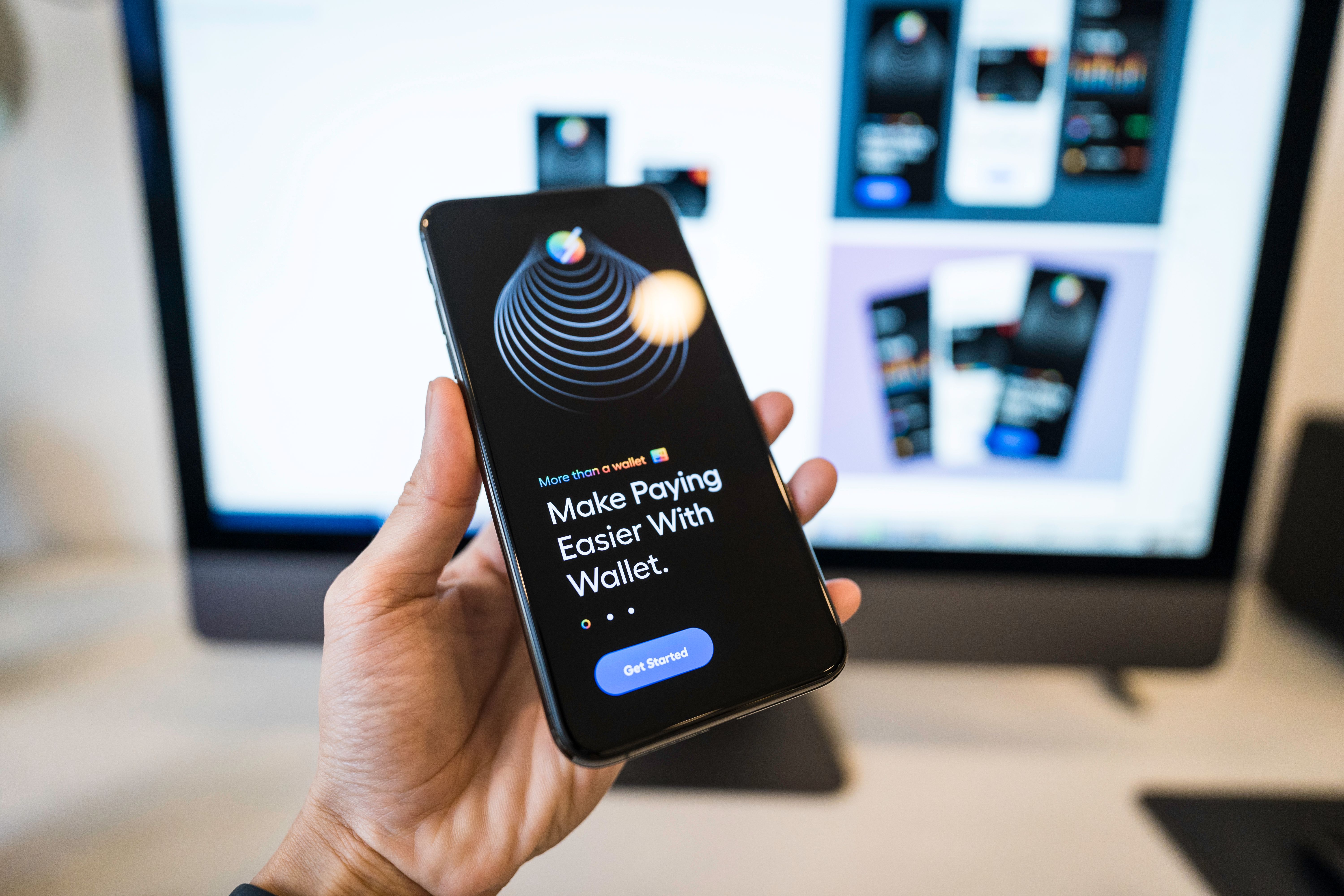
Relume – Visual First + Clear User Path

Why it converts:

  • Beautiful UI previews
  • Clear “Start for Free” CTA
  • Product explained visually, not text-heavy

Takeaway: Show the product in action within seconds.

Flow Ninja – Strong Service Positioning

Conversion features:

  • Straight-to-the-point messaging
  • Trust symbols (brands, awards)
  • Video hero section

Takeaway: Use multimedia to showcase your agency’s skill set.

Notionlytics – Data-Driven Benefits

Why it performs:

  • Benefit-focused copywriting
  • Clean layout with simple icons
  • CTA repeated multiple times

Takeaway: Repeat your CTA throughout the page to reduce friction.

Dorik – Feature Highlights That Sell

Conversion factors:

  • Powerful feature icons
  • Comparison tables
  • Community proof

Takeaway: Comparison charts remove uncertainty and boost conversions.

Attio – Premium SaaS Look & Feel

Why it’s effective:

  • Modern visual identity
  • Crisp typography
  • Easy-to-understand product demo

Takeaway: High-quality design builds trust instantly, especially in SaaS.

Potion – Personalized Video Demo

Key conversion drivers:

  • Personalized video examples in hero
  • Clear explanation of the value
  • Simple CTA: “Create a Video”

Takeaway: Personalization dramatically improves engagement.

Landify – Mobile-First Approach

Why it converts:

  • Designed primarily for mobile
  • Fast loading time
  • Minimalist structure with strong buttons

Takeaway: If your audience is mobile-heavy, design mobile-first.

Mailbrew  Emotional Copy + Calm Design

What makes it convert:

  • Soft colors + relaxed visual flow
  • Emotional messaging
  • Clear onboarding steps

Takeaway: Landing pages can convert through calm design, not just bold visuals.

Webflow gives designers the flexibility to build landing pages that both look amazing and convert better than traditional templates. By studying top-performing pages, you can reverse-engineer what works and apply the same principles to your own projects.

Back to blog page